Brand Development
Every brand has a story to tell. Brand Development is more than a focus on visual brand identity, it’s an extensive process that consists of discovery, definition, design, and application. Not only are we defining the ‘who’ and ‘what’ but also the ‘why’ at the heart of every brand. With Christina’s background in design and advertising, she is able to partner with brands to methodically approach this daunting process and act as a guide at every step.

Cedar & Oak | Austin, TX

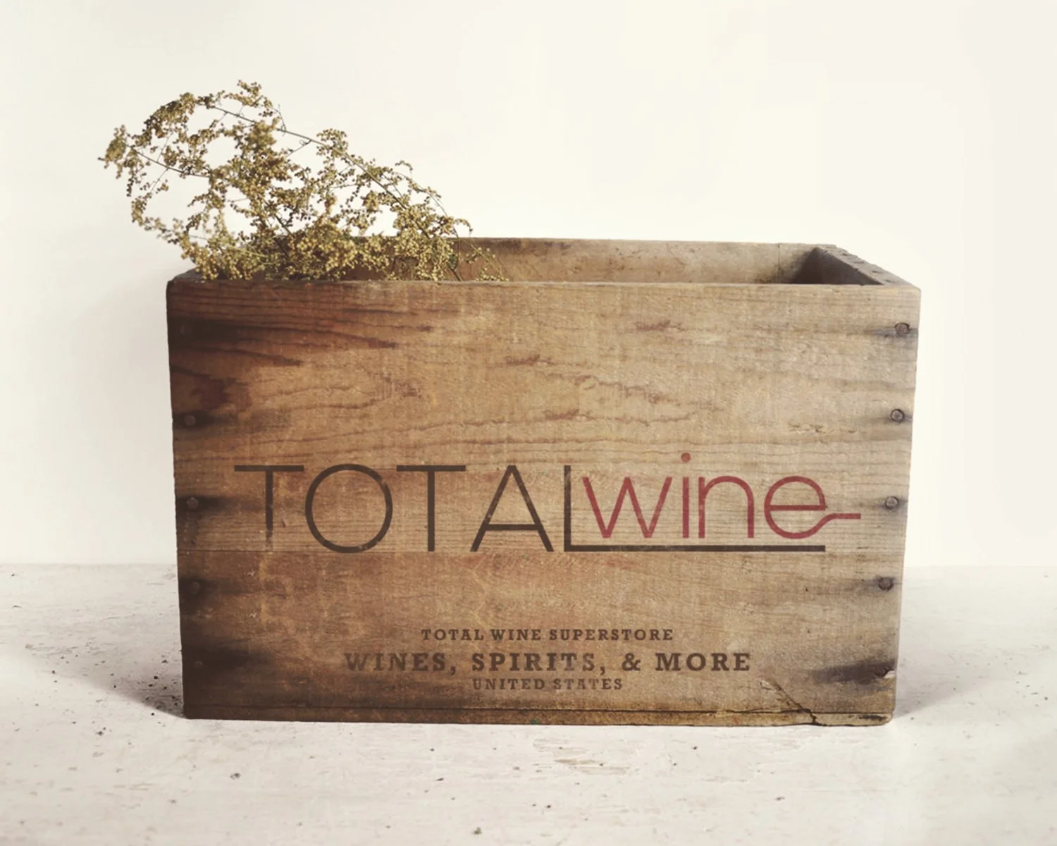
Total Wine | National, US

Kickstand | Austin, TX
Cedar & Oak Brand Refresh
Christina partnered with Cedar & Oak in the Fall of 2024 to help the company refresh their visual brand identity and realign their marketing and commercial strategies. Cedar & Oak is a full-service design firm who specializes in building bespoke homes from concept to furnishing in Austin, TX.

Total Wine Brand Refresh Proposal
This piece was derived from an extensive research and analysis project. The following content introduces the existing brand, "Total Wine & More" and walks you through Christina's conceptual design solutions as well as her comprehensive research and breakdown.
-
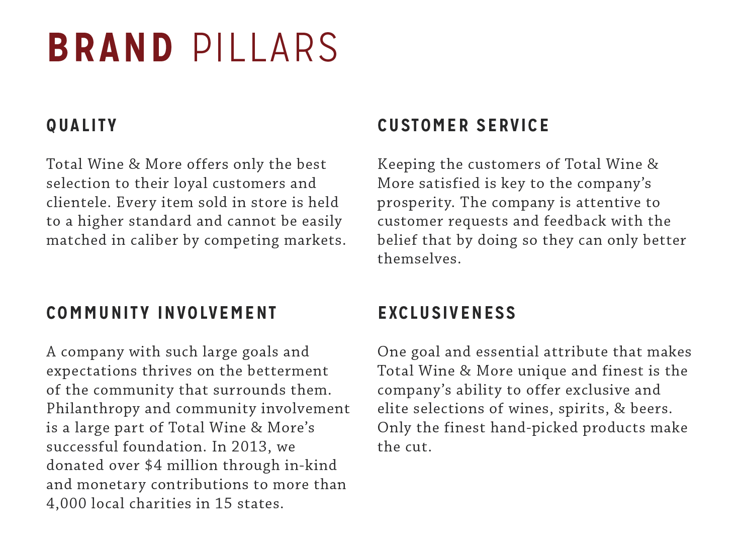
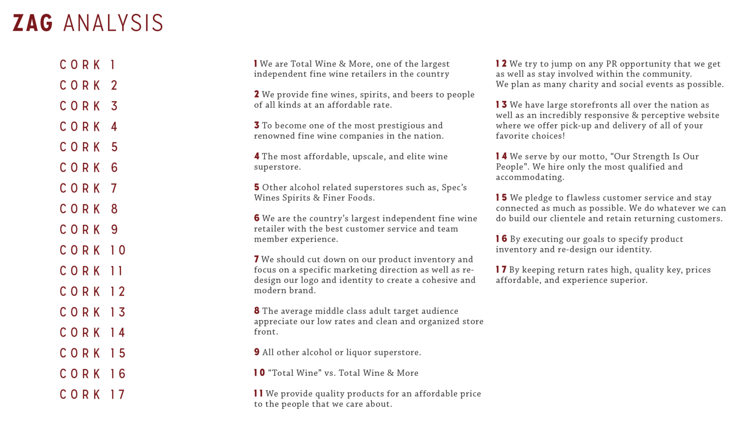
In 1991 David and Robert Trone founded what is known today as one of the largest and most successful independent fine wine retailers in the country. Total Wine & More, also known as “America’s Wine Superstore” prides itself on it’s vastly large selection of fine wines and access to exclusive carriers.
Each Total Wine storefront carries approximately 8,000 different types of wines from every wine-producing region in the world, including 2,500 that no one else carries. Not only does the company specialize in exceptional wine selection but also offers almost 3,000 types of spirits and 2,500 different kinds of beers as well as unique paraphernalia to pair with your beverages!
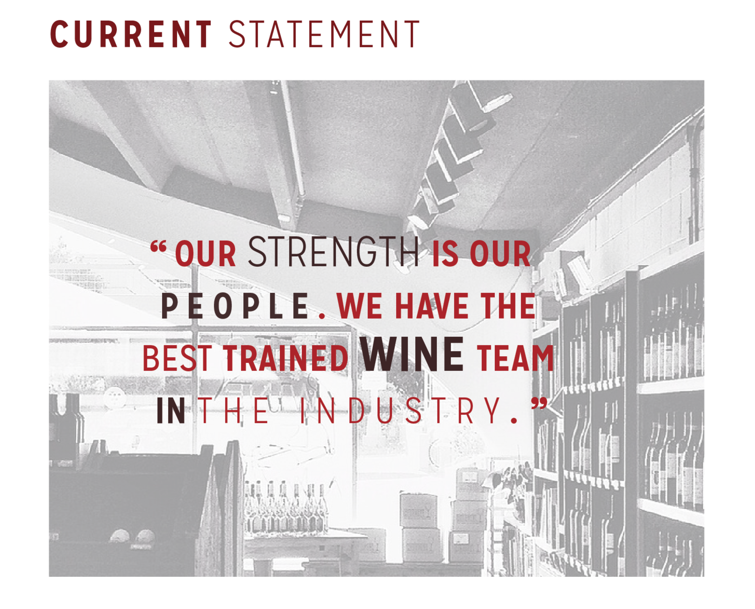
Total Wine’s team members dedicate themselves to providing only the best selections for their customers and clientele, even if it means traveling the world to do so.
Throughout travel and research process, members have the opportunity to find new and exciting wines while forging great relationships with hundreds of national wine growers. These relationships give Total Wine & More only the best and most exclusive access to many truly exceptional wines at a cost efficient rate. This gives the company the opportunity to satisfy their customers in yet another convenient way that not all competitors can match. -
Total Wine hopes to become one of the most prestigious and renowned fine wine companies in the nation by constantly building relationships and staying dedicated to their future. The company has visions for a successful and growing industry that becomes a “favorite” in every wine lovers’ heart.
-
Total Wine & More was founded in 1991 in Miltown, Delaware. The Trone brothers, David and Robert first initiated their business by opening two small wine retail stores. The two worked diligently and committed themselves to expanding their businesses. After time and many executions of trial and error they managed to successfully expand their businesses into several different states.
In 1998, Total Wine & More purchased five different Total Beverage stores from the Dart Group. It was only shortly after that in 2002 when other prosperous executives were brought into the operation from outside major retailers and the expansion was able to make a steady rise. Because of this, the company is proud to exist where it is today. -
Lukas Liquor Superstore
Sigel's Fine Wines & Great Spirits
Spec's
Gabriel's Liquor Outlet -
Total Wine & More was predicted to exceed $1.3 Billion in 2012 and was successful. Today there are 103 stores nationwide and over 2,00 employees.
Currently, Total Wine & More identifies itself with a loosely designed vector image plus type solution “logo”. The logo is seen on the front of each store in color as well as on store commodities and packaging in black and white. -
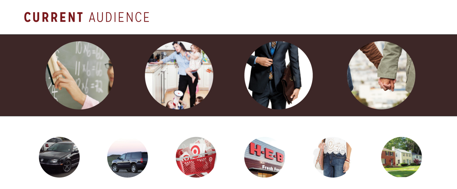
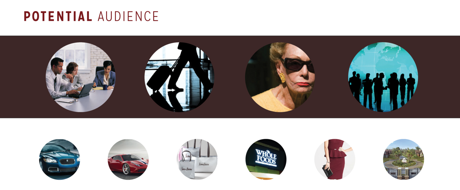
Re-branding this company would be beneficial to expand it’s target audience and help grow it’s business. Total Wine & More is widely recognized by local newsrooms for their “do good” approach and of course their outstanding selection in wine & “more”, however, their marketing approach and design is not specific enough.
To begin the process, start with the logo face and completely re-do and re-design. Create a new color palette & typeface selection to salvage the value of the company and to put new direction and life into the company’s concept.
Strategic Planning
This brand should have a classic approach and feel. It should feel as though these employees and professionals have gone above and beyond to research and retrieve this overwhelming and powerful selection of great wine just to please their loyal customers — which they have. The store itself has hints of neutral tones reflecting a winery feel, this should be a starting point used for inspiration in design and exploration.
Prospective Changes
{ brand name changed or shortened
{ new logo & identity
{ more narrow product inventory and direction
{ newer and improved marketing plans
{ packaging and commodity expansionLogo Design
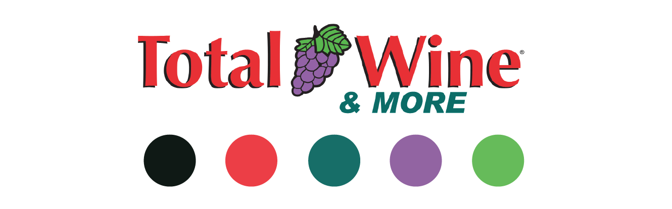
The proposed trademark or logo design is shown here in both black and white as well as in color. The conceptual design presents a clean solution to a modern logo that represents the brand and it's mission. The typography choice is simple and the shape is innovative as it represents a wine bottle.Typography
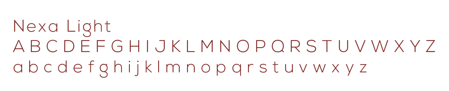
Nexa Light
The proposed type solution is here in the correct weight however, it is not to scale. This design decision was made to reflect the modern take on rebranding Total Wine and to compliment as well as contrast within itself.Trademark
Color Palette
The color palette that is shown is inspired from the deep values that lie within the creation of wine. They are bold statement colors yet clean & concise.
Applied Brand
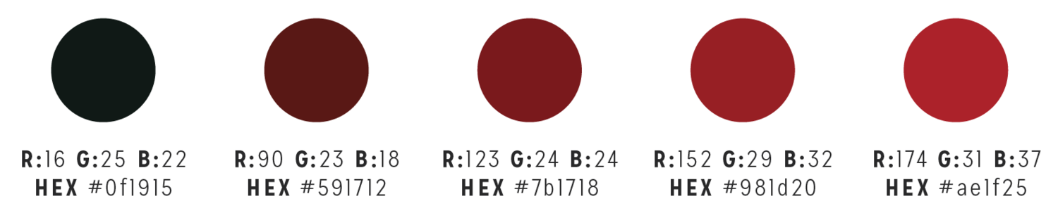
Color Palette
The color palette that was used for the branding book is derived from the trademark’s palette. This is just an extended version of the first to keep the entire brand and book cohesive.The Conclusion
Finishing
In conclusion, the future of Total Wine & More shows great promise and opportunity. Though the work load is heavy, it is sure to prove valuable and beneficial, leaving nothing but positive impressions.
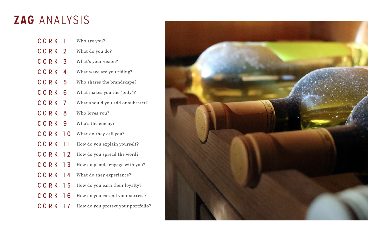
Brand Pillars | SWOT Analysis | ZAG Analysis | Target Audience

Visual Brand Identity | Trademark Logo | Brand Colors | Typography


Applied Branding Examples


Kickstand | Brand Identity & Art Direction
Kickstand was conceptualized with a group of creative peers. The original objective of the project was to create a brand identity that showcased a mundane product. After weeks of brainstorming and working sessions, Kickstand was born. In an effort to re-energize a local bike shop, Christina and her peers spent time developing the brand’s identity from start to finish, focusing on the mission statement, value proposition, buyer personas, and visual brand. The group selected a general bike company whose mission was to execute quality bike repairs at an incredibly fast rate. This brand was then named "Kickstand" and was said to have originated in Austin, TX.

-
Research was conducted by identifying consumer demographics and creating audience personas. Audience personas are fictional, archetypical customers that ascribe a profile, needs, wants and expectations in order to design the best possible brand and brand strategy.
The brand developed through many hours of brainstorming and stacks of sticky notes - several mind maps and word lists later, "Kickstand" was named and an identity was in play. It was important to the designers to originate a single conceptual design that captures the message with a modern twist, thus the kickstand logo was created. Following this, a second icon system was created. This icon hopes to be known as the "Kickstand K" in the future. -
Kickstand’s website design and overall construction not only reflects the brand’s design in identity but the mission as well. The site has been carefully formulated to compliment Kickstand’s theory of efficiency, compatibility, and clean design. The website is responsive and very user friendly. For client convenience and productivity the brand also offers an app system that the user can download to his or her smart phone.
-
These mechanics are the best bike technicians in Austin! The Spokesmen Team love what they do and make Kickstand the successful business that it is. Each talented mechanic has his or her own distinct set of skills and each bring something different to the table. Together they are they dream team.
Visual Brand Identity | Logo & Trademark | Brand Colors | Typography


